
Welcome to the second part of this occasional series on composition in photography. Whether you consider it a science, an art or a craft, composition is central to creating pictures with balance and dynamism.
Part 1 kicked off with a couple of basic concepts – shapes and lines – and their role in composition. There are lots of other ‘rules’ of composition, but too often you find that real-world scenes and the objects within them are much too complex and nuanced for simple rules.
By just sticking to the idea of shapes and lines, however, it’s possible to break down even complex-looking scenes and compositions into relatively straightforward components. I’m afraid none of this is provable using mathematical theories. You might look at these pictures and disagree about some of my suggestions or the conclusions, but I hope you will at least still find this system useful for understanding how your own pictures are working.
The following ideas (and diagrams) aren’t all my own work. I’m indebted to photographer and author Axel Brück and his book ‘Practical Composition in Photography’. It was published some time ago and it’s likely you haven’t heard of it, but with the help of some striking and enigmatic black and white photography, Brück analyses the structure of images to reveal how and why they work, in a way that’s both direct and refreshingly clear. The graphic black and white look used for these images was chosen to emphasise the compositional elements in the scenes photographed. It’s been created using a framed ‘Kodalith’ preset in Alien Skin Exposure X.
For this instalment I’m going to concentrate on shapes – how to recognise them, where to place them and how to make them work together in the frame to achieve the effect you want.


What is a shape?
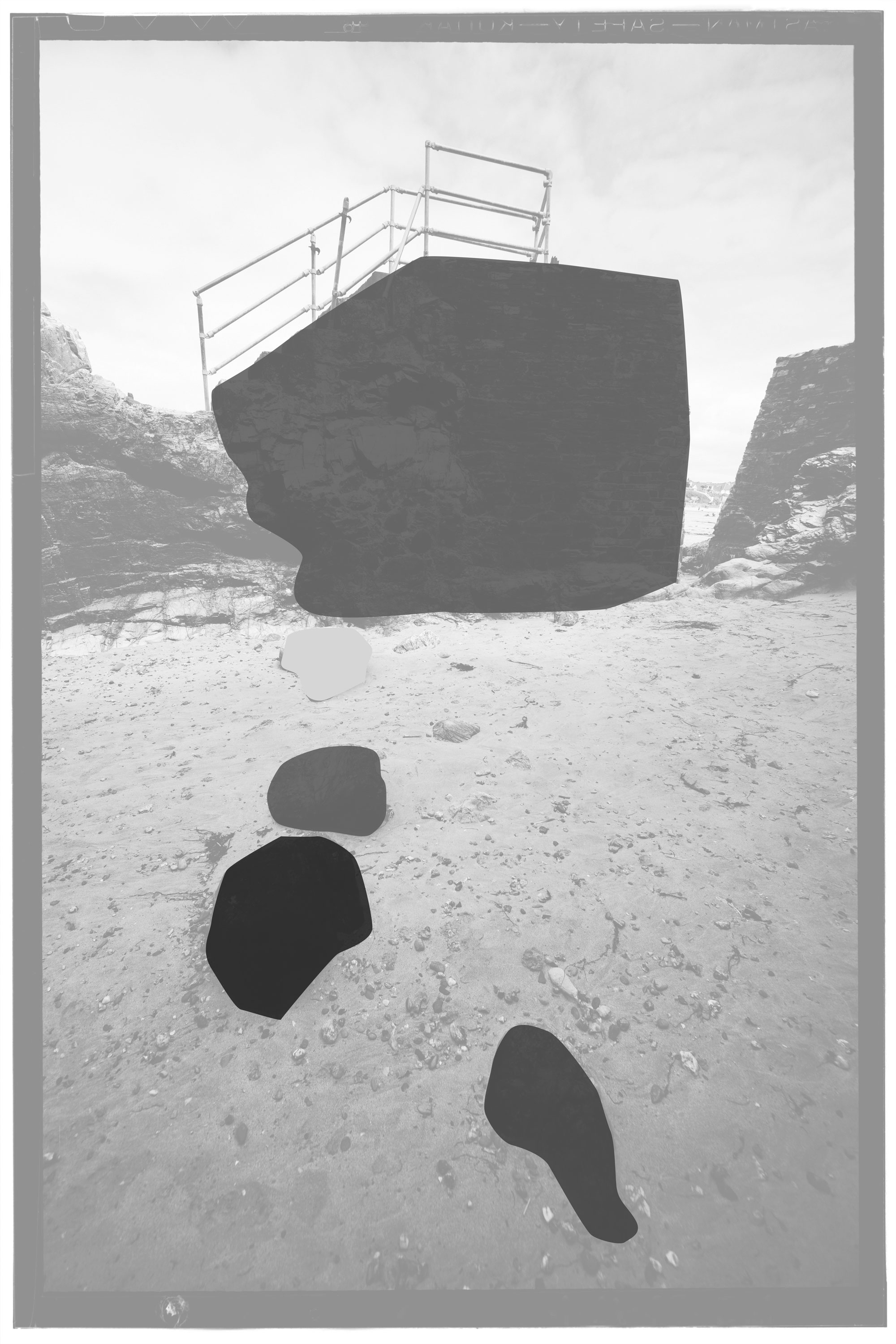
It’s very easy to take the idea of ‘shapes’ too literally as identifiable real-world objects. But composition in photography is a visual art rather than an intellectual one, so ‘shapes’ in this context are areas of similar tone that are visually distinct from their surroundings.


A ‘shape’ might indeed be a recognisable object like a tree or a rock. But it can also be a shadow, an area of dark cloud or a patch of sunlight. These carry a lot of weight compositionally and shouldn’t be ignored just because they don’t correspond to physical objects.
How many shapes do you see?
This is where you have to use your judgement. Any scene is likely to have dozens of shapes of one size or another, but most of them will be too small or too similar to their surroundings to have any real compositional significance.
The trick here is to identify only the ‘significant’ shapes in your picture. If it helps, try squinting so that you see only areas of tone, not real-world objects. Even in complex scenes, you will often find there are no more than four our five significant shapes, and sometimes only one.

There’s all sorts of expert advice on composition which assumes you have a single, principle subject in the frame. This hardly ever happens. Most of the time, you’re juggling a number of competing shapes and compositional elements, so you need to work out how to make them work together, not pretend the scene is simpler than it actually is.
Balancing two shapes
You have two main options when you have two shapes in a scene: deliberate symmetry or deliberate contrast. You can make these two shapes more or less the same size and arrange them horizontally or vertically for a deliberately static, abstract arrangement.
Or you can go for contrast. This could be contrast in tone (light and dark) contrast in size (large versus small) or contrast in position (a large object just off-centre balanced by a smaller object much nearer the opposite side of the frame, for example).


Whenever you have more than one shape in a picture, people’s gaze tends to move from one to another along ‘implied’ lines. These can be just as strong in compositional terms as ‘real’ lines.
With two shapes in the frame, there’s a strong ‘implied’ line between them. If the shapes are arranged horizontally or vertically the implied line is horizontal or vertical, producing a very static composition. If the two shapes are in opposite corners of the frame, the implied line is diagonal and the composition looks much more dynamic.
Three shapes make a triangle
A composition with three shapes works a little differently. This time, the three shapes (and the implied lines between them) form a triangle. Without getting drawn into complex geometrical theory, different triangles will give a very different feel, from right-angled triangles (two shapes on one side of the frame, one on the opposite side, through isosceles triangles (pretty symmetrical with two shapes at the base and a third as the ‘point’ roughly in the middle) to irregular triangles which can often be more interesting and dramatic.


Weight and balance
Occasionally, the things we photograph do sometimes arrange themselves neatly into shapes and triangles, and you can simplify and strengthen the composition by the way you crop a picture and apply local adjustments.
But very often the scene in front of the camera is chaotic and unordered and then you just have try to get a sense of the ‘weights’ of the shapes within it and how to make them balance. It’s a very subjective thing, but once you develop this sense of ‘balance’ it becomes easier to recreate it – and then how to ‘unbalance’ pictures deliberately to make them more disturbing or challenging.
Shapes alone don’t make a composition and lines are equally important, and these will get an instalment of their own.